COVID-19 improvement idea
This is a case study about IKEA and their customer's touchpoint journey while using a new feature during these times of social distancing — virtual wait-lines.
Problem
Currently, IKEA has implemented new safety protocols due to COVID-19. I have expanded on their changes and added a virtual wait line to the experience to help maintain social distancing but also make the experience a little more convenient for customers. This case study shows the process of creating and integrating a virtual wait line feature into IKEA's system while keeping within IKEA's branding style. It consists of 5 touch points:
Awareness, Planning, Waiting, the Experience and Follow Up.
Goal
Bring awareness of IKEA's new virtual line feature
Discovery & Research
Key Questions:
What is the problem? - People don't like waiting in lines. Its hot (or cold) and it's harder to social distance waiting around near people.
How can we solve the problem? - Integrating a virtual wait line where people wait in their cars instead of in looping lines around the entrance of the store
How do users find out about the feature? - Ads, email campaigns, word of mouth, upon visiting IKEA and seeing signage
How do I make sure the experience as smooth as possible? - Understand customers' wants and needs. Find out how to accommodate the needs and wants in an efficient and effective way. Create it. Test it. Improve on it.
User Personas
Here are IKEA customers. We learn their name, age, occupation, what their typical day looks like as well as likes and frustrations. From this, we gain important information about what customers want from a product or service.


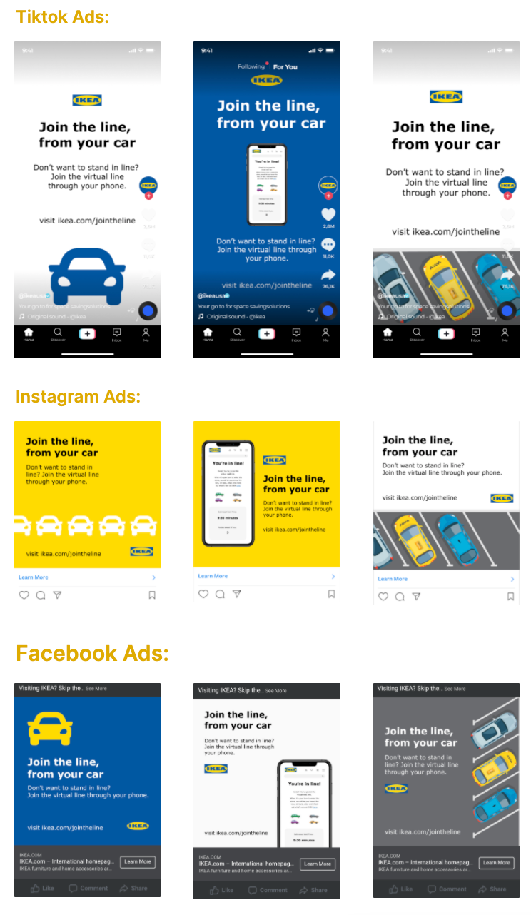
Bringing awareness through ads
Through my research, I found that Facebook, Instagram and TikTok would be key platforms for advertising and reaching IKEA's target audience, millennials. 84% of millennials currently use Facebook, and 67% use Instagram. TikTok is an underdog when it comes to advertising. I think it would be great place for IKEA to advertise since it has an audience of over 26.5 million in the US alone. It is also the 6th largest social media platform in the world. TikTok also is not as crowded with other competitors like on Instagram and Facebook.
Here are initial sketches for Ads


3 Ad Sets
Here are ads Ive designed and rendered for each platform: TikTok, Instagram and Facebook.
Planning
Usually customers will search for information. They will want to know different locations, open times and a way to contact the store or customer service. They also need to be aware of new COVID-19 protocols in place at the store. We will be using a landing page to bring awareness of safety precautions before entering the store. They will be informed and can prepare before coming to IKEA.
Important information we want to include on the landing page is how IKEA has implemented changes for the safety of workers and customers. We also want to mentioned a big change in how people enter the store. In addition to all the safety protocols in place, I am creating a virtual wait-line for customers. Instead of standing in lines, during the heat of the summer, people can now wait in their cars and socially distance from other customers while doing so. This is safer for customers and much, much more convenient. For guests who do not own cars to get to IKEA, they can stand wherever they would like and join the virtual wait line as well.
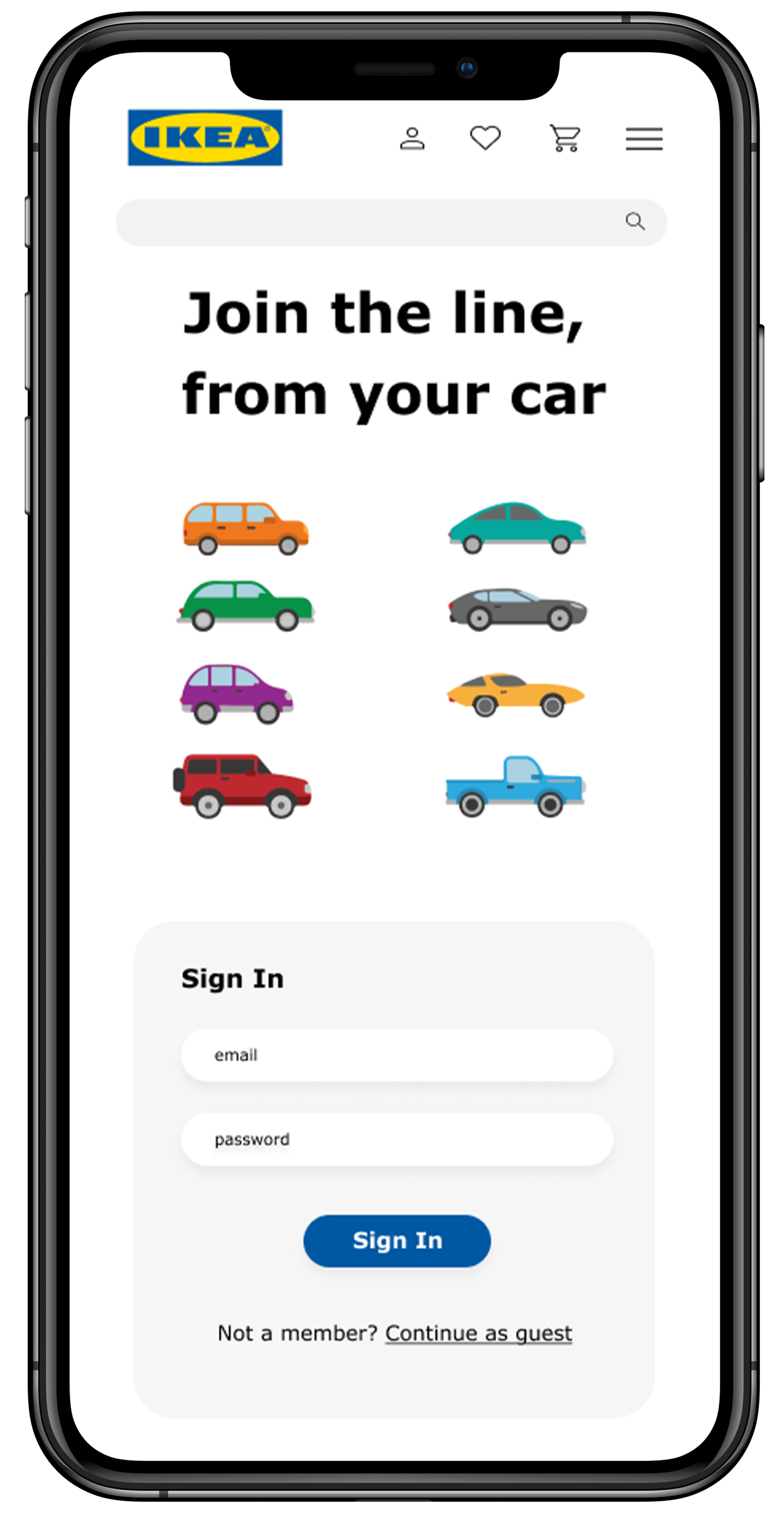
Landing page
Included on the landing page is a link to join the virtual wait line. The copy briefly explains how to "wait in line" and when it will be safe to enter the store. I chose this image because I think it'll be easier to understand the message.


WAITING
I've created the in-app/mobile web browser experience for customers to virtually wait in line. Most customers will be accessing this site via their personal devices so designing for this case scenario is important.

Initial Sketches
Simple sign in/ continue as guest - This makes the process easier for the customer. Straight forward, instinctive buttons: I want customers to feel like they know what they're doing and can instinctively engage with the site.
Name, Number, Email, Party Size, Purpose of visit - This will need to be filled in my customers who choose to continue as a guest. This information helps make the process for them pretty seamless and quick. By knowing party size, IKEA's system can count how many people are in and out of the store at any given time, keeping with safety protocols of having a maximum number of customers. I chose these because I think this is crucial information for the process to be as smooth as possible.

Final Digital mockups


Experience
I show the way-finding signage used to navigate through IKEA, starting from the parking lot to the exit. The signage is a crucial part of this case study. It helps send a message to customers without them having to ask to search for information. The signage explains what to do before realizing that task that needs to be done
2 important signages to be designed for:
Parking signs - without this, customers would not understand what the ticket they receive upon entry is for. They would need someone to explain the process to them. A large parking sign with simple, quick instructions (because they are driving in) will help them quickly understand what to do when they arrive at IKEA.
Entrance signs - After waiting in their car, customers need to know where to enter. There are two ways in and out of the building. If we don't have exit or enter sings, this can confuse customers. To keep with safety protocols, having a specific enter only and exit only door is crucial.
Final designs FOR Virtual Wait-line Signage:
Parking Signage:
This is what customers would see upon entering the parking area. It has a brief explanations on how to join the virtual wait-line. The blue or white signs will be highly visible in the parking lot since they have high contrast among the trees and stand high up enough above the ground so that cars do not block the signage.


Entrance Signage
Depending on the color of the entrance wall, these are what the entrance signs might look like. The main objective is to guide customer to the front door and inform them what they should do when they get there. The copy welcomes them back and the image of the device shows customers what they should be presenting at the front door so they can enter.

Thank you for reading through my IKEA virtual wait-line case study! For a more detailed view, please click here.