Umbú is an exotic juicery that celebrates the vibrant flavors of rare and tropical fruits, and my role was to develop the branding for this exciting new company from the ground up. The client entrusted me with the task of creating a distinct brand identity that would capture the essence of their vision while setting them apart in a competitive market.
To achieve this, I began by deeply understanding the client's goals, target audience, and the unique attributes of their products. The branding process included:
Brand Strategy Development: I crafted the brand’s core identity by defining its mission, values, and tone. The goal was to position Umbú as an adventurous and refreshing choice for health-conscious individuals seeking something extraordinary.
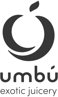
Logo Design: I designed a logo that embodies the juicery's exotic essence. The logo blends modern, organic elements with vibrant colors inspired by nature and tropical fruits. The typography was carefully chosen to convey a sense of energy and freshness.
Color Palette & Visual Style: I curated a dynamic color palette that reflects the exotic and natural qualities of Umbú’s juices. Bold greens, sunny yellows, deep purples, and bright reds were combined to evoke a sense of excitement and healthfulness.
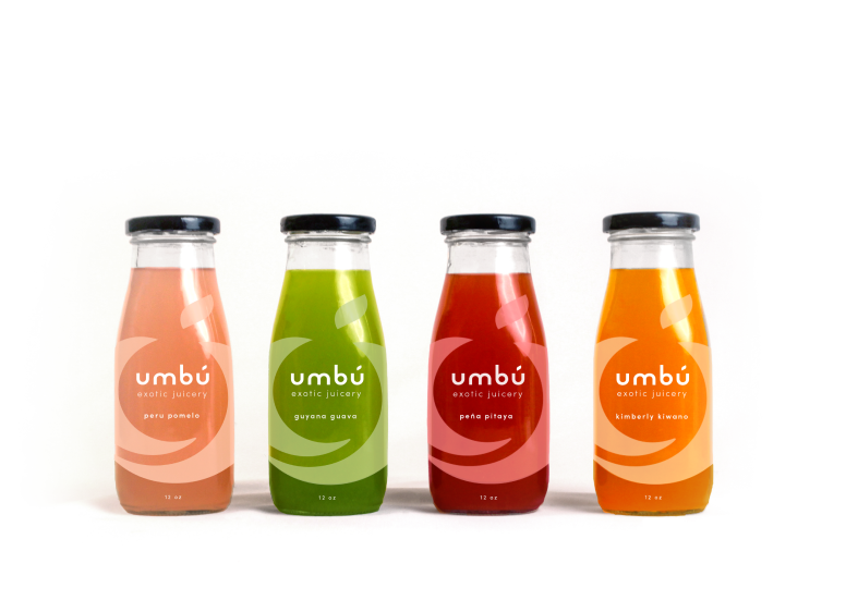
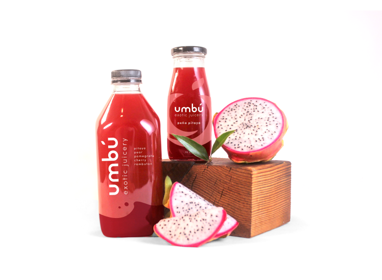
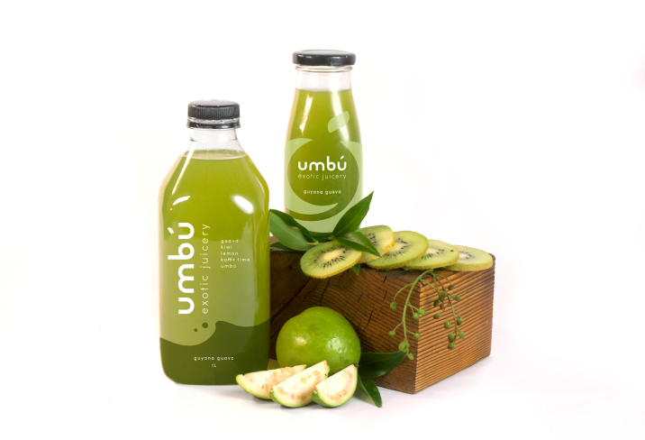
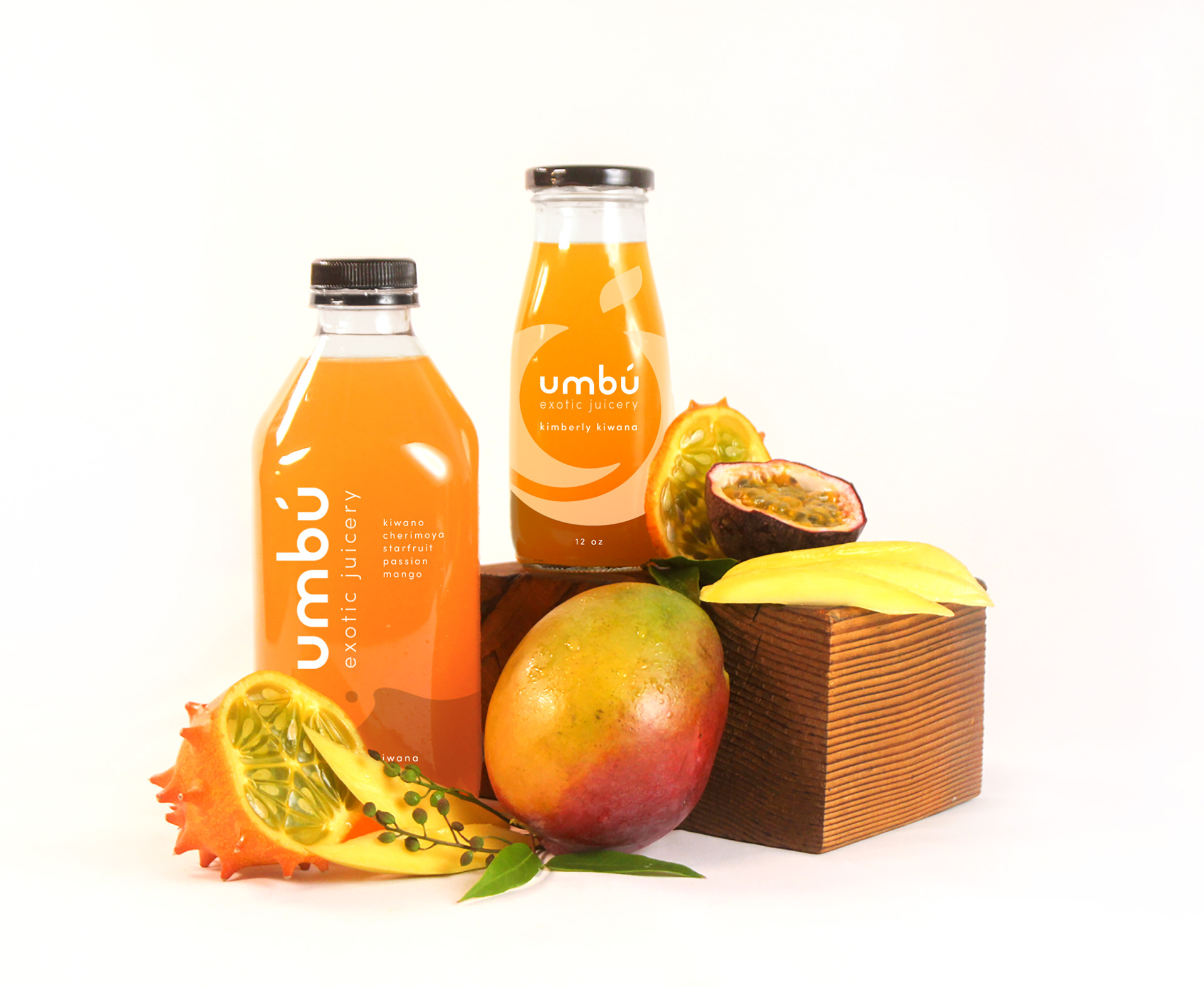
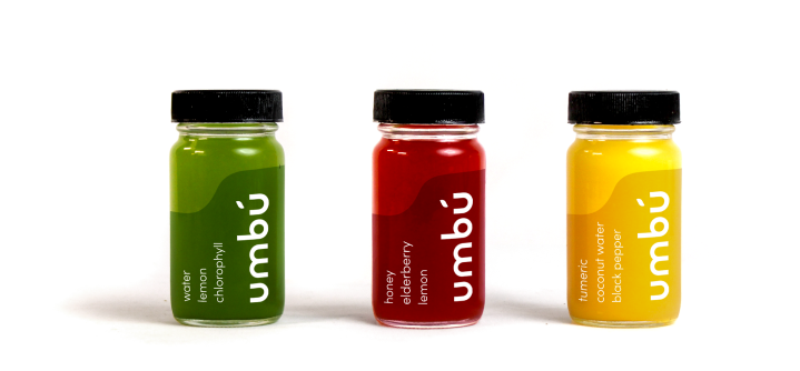
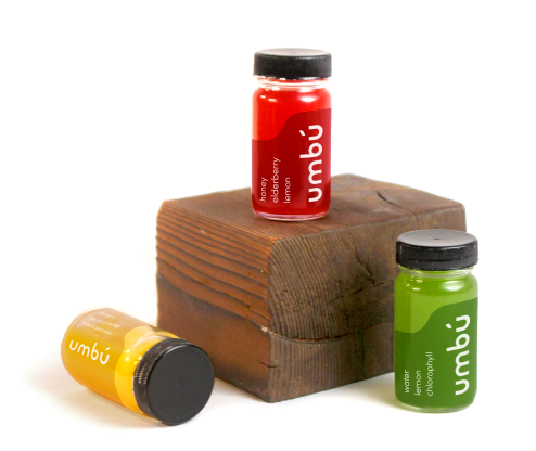
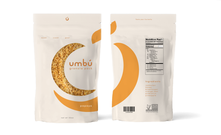
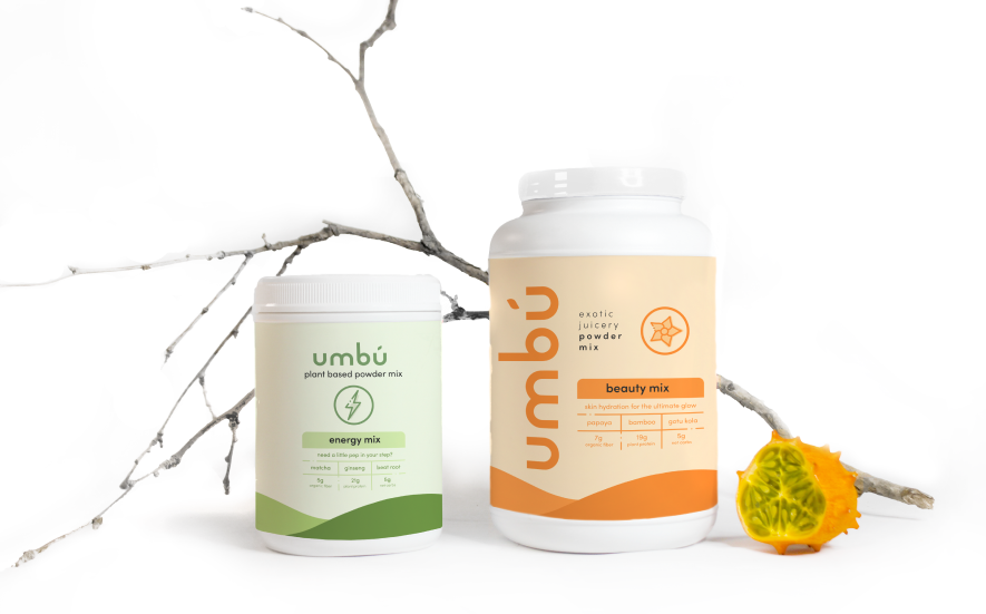
Packaging Design: I developed packaging that highlights the natural and exotic ingredients of the juices. The design incorporates eye-catching fruit illustrations and clean, contemporary typography to ensure visibility and appeal on shelves.
The result is a cohesive and vibrant brand identity that captures the adventurous spirit of Umbú, making it an irresistible choice for juice lovers. The branding not only reflects the company’s essence but also positions it for growth in a competitive market.
Behind the name
Umbú is the Portuguese name for the Brazilian plum fruit. The name is derived from Brazil where the founder first grew the umbú fruit.
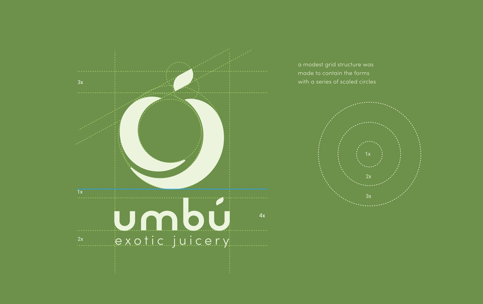

The logo is composed of the type and mark. It is set in Reross logotype.
When set horizontally, the logo should have enough space around it, equivalent to the u in the logo.
When set vertically, the logo should have enough space around it, equivalent to the m in the logo.
When set horizontally, the logo should have enough space around it, equivalent to the u in the logo.
When set vertically, the logo should have enough space around it, equivalent to the m in the logo.
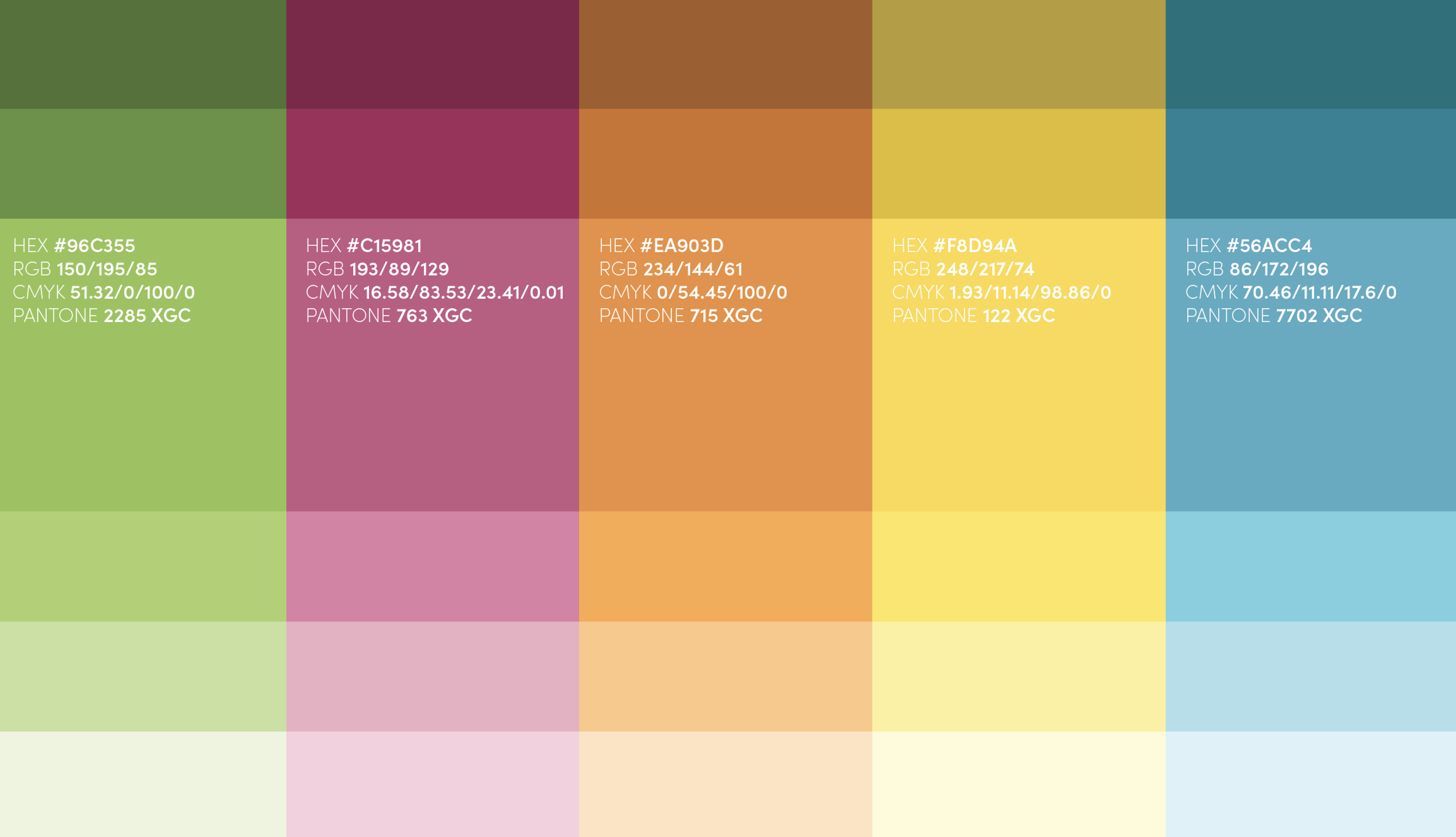
Color Palette
This color palette was selected based on the colors of the exotic fruits served at Umbú. Green comes from the color of the umbú fruit, a pink from the bright color of dragonfruit, orange from kiwano melon, yellow from mangoes and cherimoya fruit, and the color blue is known the relax the nervous system.
Products